Roxi Music
A New Interface


That’s the power of a well executed UX and UI strategy.
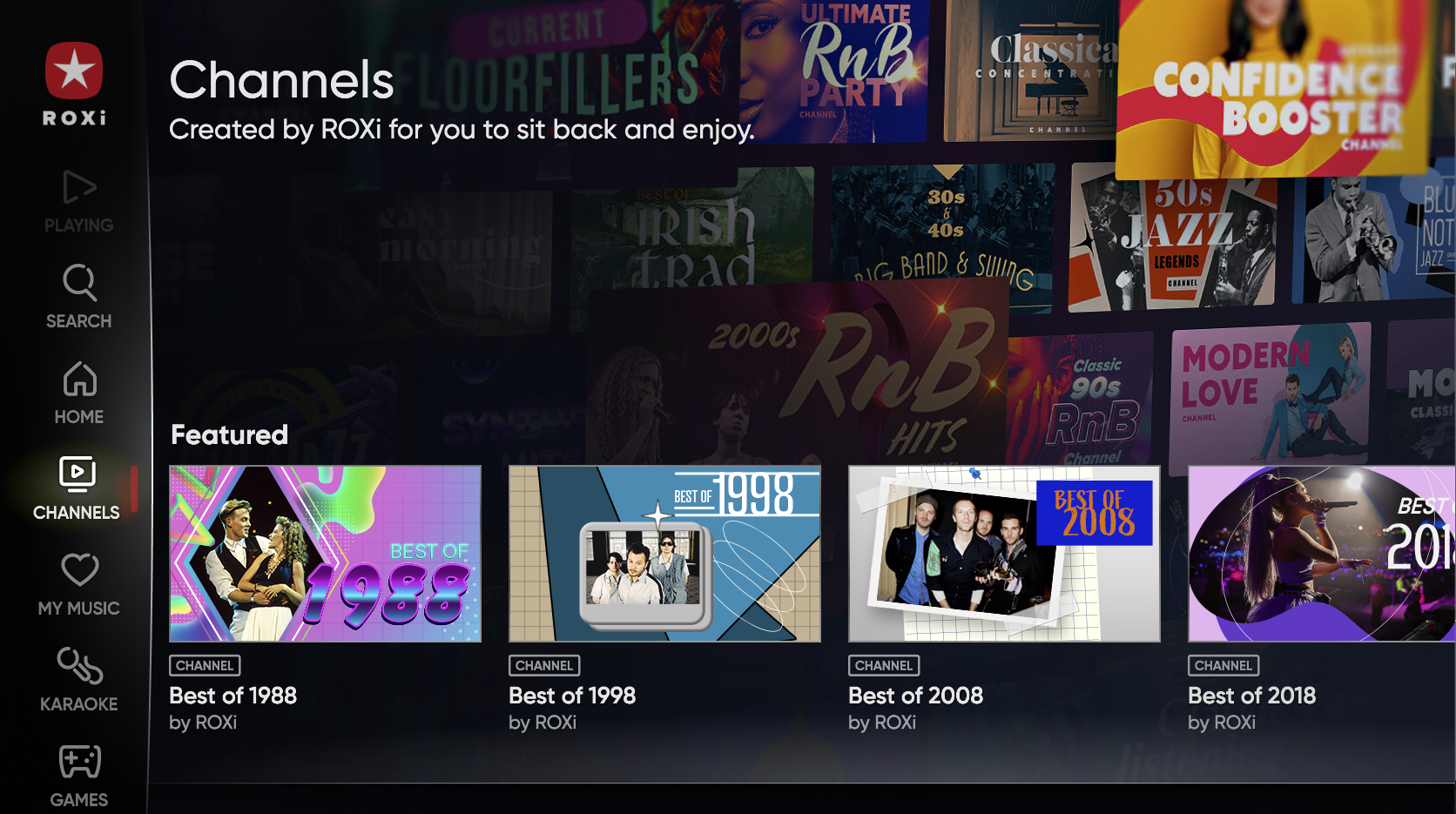
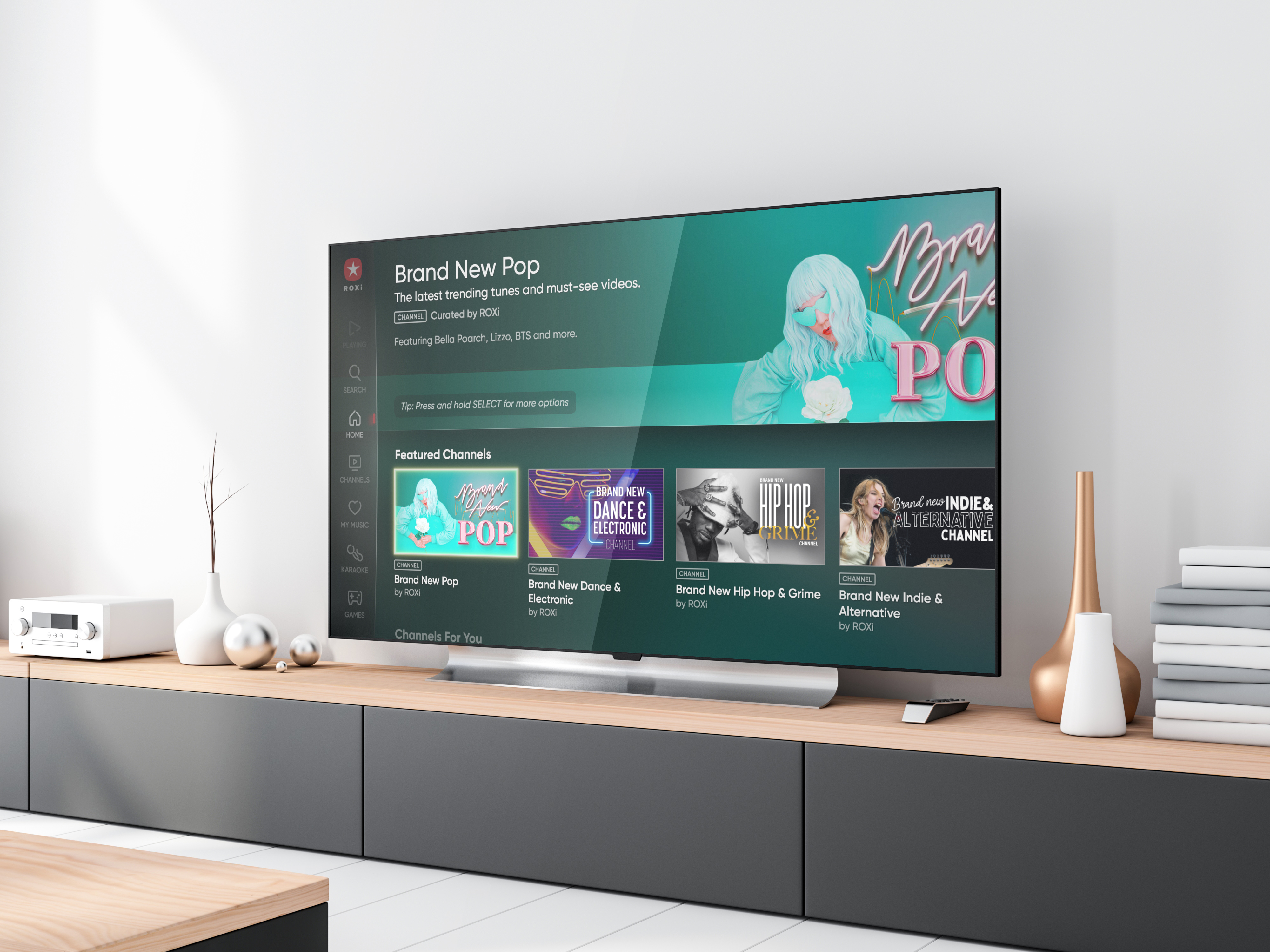
ROXi, the music streaming, entertainment, and karaoke app with a TV first experience, has 70 million music releases, exclusive music channels, karaoke, and music games. We were engaged to undergo a complete overhaul of both the interface and user experience of the ROXi app.
The app was already performing well so it was vitally important that any updates to the UX and UI delivered genuine value to the end users. Following extensive research, usability testing and implementation we were ready to go live.
The result following the re-launch? The stats don’t lie – A new sign up every 15 seconds!
Following the successful implementation of the UX and UI strategy, ROXi approached us to produce their TV and online ads. Shot in the studio, the production included video animation, tech sequence, music, voiceover and editing.
As ROXi creates so many ads that require a quick turnaround, we suggested building a Video Toolkit. Built in a modular fashion, the Toolkit allows the internal creative teams within ROXi to output high quality broadcast ready adverts of various durations quickly and easily.
The Toolkit supports multiple parts of the ROXi eco-system from broadcast ads to in-app loading screens and social campaigns.


Updates and iterations of the core master creative (originally built by ourselves) can now be deployed more cost-effectively without the need for external resources.
As the complex components (animations, sequence, effects, etc) and intricate elements are all done, ROXi simply has to edit the tech sequence, enabling them to produce high quality ads in a quick timeframe.

